

Official blog for Jennifer De La Rosa, Realtor, serving home buyers, sellers and investors in Maryland. Follow for creative content on real estate, home renovation and decor, and more!

Choosing the Right Paint Finish
As if selecting the one color you want to paint your room from the ba-billions of options available isn’t hard enough…Then you also need to know what finish you want…whaaaa? Not sure where to start? Find out what finish goes where and when.
Choosing the Right Paint Finish
After scouring paint swatches and looking at them during different times of the day to see what it will really look like, you think you’re ready to paint your home! You head over to the local home improvement store where they then ask you what finish you would like….whhhhhaaa?
More options. Using the wrong finish can make or break a paint job. I mean, there are reasons there are good reasons why there are so many choices, right? Below, you'll find the most common finishes and recommendations on where and when to use them.
- PAINT FINISHES -
Flat: a low-sheen paint with a non-reflective finish that touches up well and hides minor surface imperfections. It's ideal for low traffic areas, interior walls and ceilings.
Matte: a low luster reflective finish that is durable, easy to clean, touches up well, and also hides minor surface imperfections. It is great for low to moderate traffic areas, such as bedrooms, and interior walls.
Eggshell Enamel: a soft, velvety appearance and is a good choice for moderate traffic areas such as living rooms.
Satin Enamel: a pearl-like appearance, and are painting moderate to high traffic areas or areas that have some exposure to moisture, such as kitchens.
Semi-Gloss Enamel: a sleek, radiant sheen that is great from cabinets and trim, high-traffic areas and high-moisture areas.
Hi-Gloss Enamel: a brilliant, shiny appearance with a glass-like finish. This is great for high-use surfaces.
And if you have kids, don’t bother using anything below a Satin finish, unless you plan on breaking out the paint can to touch up the walls.
What a Difference a Coat of Paint Makes!
Remember back in January when we wrote about the importance of painting your front door to add value and curb appeal? Here's a real-life example from one of our listings.
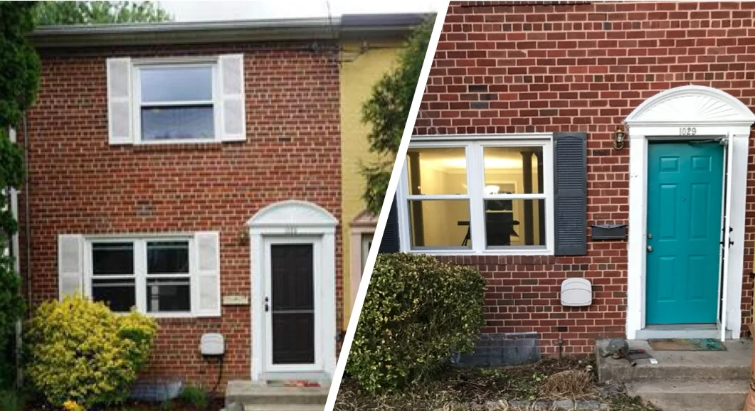
Remember back in January when we wrote about the importance of painting your front door to add value and curb appeal? Here's a real-life example from one of our listings. This homeowner is selling what might have been a fairly non-descript, brick-front townhome that might have looked like all the others nearby. Instead, with just a quick coat of paint, she made her home more eye-catching (and appealing) from the street - all without spending much at all!
We advise all our sellers to consider updating their home's entrance, starting of course with fresh paint on the front door. As budget allows, you'll also see a great return on updating your door's hardware, adding fresh mulch and plants, and power-washing your home's exterior.
If you're considering selling your home, I'd love to chat with you! I personally service homeowners throughout central Maryland, and can refer you to a talented real estate agent anywhere in the world - so don't hesitate to contact me!
Add Instant Curb Appeal (And a Vibrant Pop of Color!) For $40 Or Less!
Truth be told, I am CRAZY about bright, colorful front doors. They're just so welcoming, and instantly modernize and refresh a tired, dated home exterior. That's why I recommend a fresh coat of paint on the front door to all of my seller clients as part of the process of getting your home ready to list.
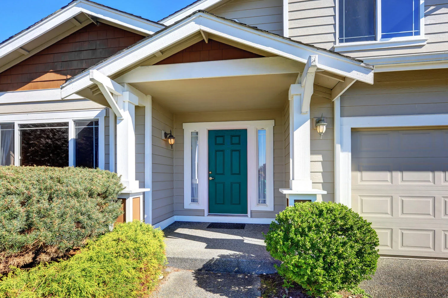
Truth be told, I am CRAZY about bright, colorful front doors. They're just so welcoming, and instantly modernize and refresh a tired, dated home exterior. That's why I recommend a fresh coat of paint on the front door to all of my seller clients as part of the process of getting your home ready to list. (Find out my other suggested home prep tasks here!)
Last year, I posted to Instagram about my current favorite front door colors, and got a great response. Since not everyone uses Instagram - which, CRAZY - I thought I'd share my recommendations here, too. Everyone deserves a splash of color in their lives and on their doors!
The Best Front Door Paint Colors: A Realtor's Recommendations
I'll break my list down from most conservative to most punchy, so that there's something for everyone. We all have to find our own comfort level with color! Also, I think it's worth mentioning that a coat of paint (or two, or three) is hardly permanent. You can repaint your front door as often as you like - when the seasons change, when your mood changes, or anytime you start to notice a little wear and tear.
Without further ado:

Not-So-Basic Black: Benjamin Moore Onyx
For those not fully ready to commit to color, I present a sophisticated "almost-black" that adds a touch of refinement without looking like cheap black spray paint. This color works great on homes with more classic or traditional architecture, and adds a little drama without clashing with anything.

Neutral Elegance: Benjamin Moore Gentleman's Gray
Another safe, subtly sexy shade that looks smart on a classically styled entry door. (I especially love the little touch of bluish-teal in this deep gray hue!)

Pewter with Polish: Sherwin-Williams Gibraltar
For an upscale gray that isn't quite as dark, I recommend this mid-tone shade. It looks great on all kinds of homes and is just enough to upgrade your entry without shouting from the rooftops.

A Spicier Red: Sherwin-Williams Crabby Apple
Few colors are as classic for a front door as red, and this delicious shade gives it a unique twist. I love how rich it looks, and it pops against lighter-colored homes with virtually any deign aesthetic.

Gold at a Glance: Benjamin Moore Marblehead Gold
Golden yellow is such a gorgeous shade for a home's front door - it pops right off the house and looks incredibly inviting. This one is a little more refined and less like a traffic sign.

Wine With Everything: Sherwin-Williams Blackberry
Paints in this color family always look so rich and luxurious to me. Plum, wine and burgundy are so unexpected for a front door, yet add some interest without being garish. This paint is probably my favorite of the bunch.

Oceanic Style: Behr Galapagos
Teal, a complementary color for so many home styles, is both eye-catching and upscale. As seen in the header image on this post, it brings a little color without being overbearing. This shade is one of the best I've found.

For the Trendsetter: Behr Tahitian Breeze
Come on...I wouldn't be blogging authentically here if I didn't recommend at least one paint shade that isn't for everyone! This confident and captivating color may be too much for some homes (and some homeowners) but for people who really want their home's entrance to pop, this is it!
Are you convinced yet of the power a colorful door can wield? If not, check out this collection of beautiful front doors using some of the colors I've referenced above:


